

My idea for a re-brand of the Arts School was to rework iconic masterpieces to portray a more modern style to show that we are the next generation of creative's.
My first piece was to create the figures from American Gothic into KISS fans. Another aim of my design is to cause some controversy and maybe give the feel of a young design anarchist as it were. At the moment the college has no personality on the outside of the building, which is why it is often mistaken for the Linacre outpatients center that stands adjacent. Inside the college there are some great aspects of design on show and many works by the students appear on the walls. The bright and interesting interior of the college needs to be continued to the outside of the college. It seems silly that alot of gret ideas and artwork is hidden away inside a boring, plain brick building.

I also wanted to use other works of art around the college to add a touch of class and to improve the overall image of our college. An extract of the Sistine Chapel worked well on our Automatic doors. The fingers will touch as the door closes. On reflection, the numerous posters and stickers should have been removed from the doors, it hides the subtle details of the piece of art. A clean image would have worked an awful lot better.

This is St John the Baptist by Leonardo Da Vinci, a religious figure painted by one of the greatest and well known artists. So i gave him tattoos, made him stick his middle finger up and scrawled "F**k Art" in a graffiti style to really raise some eyebrows and hammer home this "generation wild" image that i want. Everything this painting stood for i have changed and there is no doubt this will cause major controversy with many different people, however this will defiantly put our college on the map; for the right reasons? maybe. Any publicity is an improvement to what we have now.

I was just playing around with the American KISS image to see how it would look as a banner or possibly as a projection, an idea i researched into at the start of the brief. I would have liked the image to stretch the full height of the building but unfortunately the dimensions of the image did not allow it. The sign beneath the image (pointing in the direction of the reception) will also be altered.
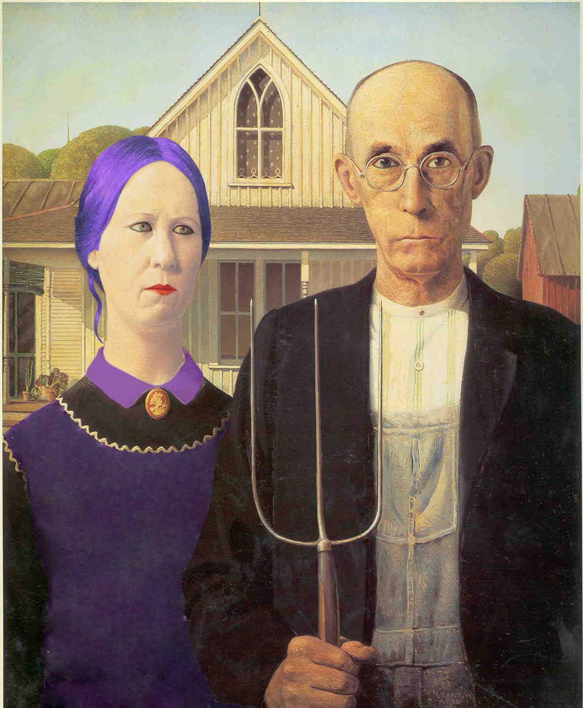
I was trying out the idea of maybe altering the Art specifically for each course, instead of having one image advertising the entire range of courses. I tied to alter the American Gothic to represent the fashion course but i was limited with what i could do to the male figure, so i have decided to put that idea on hold and continue to expand on my original ideas that i took from my research. The original image seems to work and include aspects of a few different courses that the college offers.

I photoshopped the image onto the side of a bus to see if the image worked and weather it would be effective. I am not totally sold with the location of the image on the bus, after talking to Dave i am going to try the image on the back of the bus and also on the rear corner with the female figure on the back and the male figure on the rear side. A logo or info about the School of Arts needs to go on as well, i will put that on after i have decided on a final location for the art.

For the front cover of my prospectus i wondered if a an ornate frame would set the image off. It would reinforce the look and feel of the classic art image, however is that what i really want? For a start the frame that i used above is too thick it takes the focus away from the artwork, but most of all i am altering classic art to a more modern and anarchist style so i don't want to make the image look too "old fashioned". Maybe a more modern stylish booklet would be fitting.

I have chose a square shape for my booklet because on the whole i want a clean and simple design. I still want the main them of "Punk Designers" to show through but in a more sophisticated and managed way rather than an untidy scrawl of random splats. I don't think the type i used on the image above works, it makes the cover look too held back and restrained, i would like the expression of my theme to show through more. Maybe a spray painted type like the "Fuck Art" piece from further up.

As i decided from my research i wanted an HDR image of our college for the first page with a simple "Welcome" and maybe a nicely laid out contents, written on an a slightly transparent background. For the moment i just have the HDR image and the "Welcome" which is the same type as i used on the cover. Again this type will change if i decide to use the graffiti style type that i spoke about. I am not 100% happy with the image, the car in the photo is distracting and the sky looks dirty. I did this HDR image by using 1 photo in a program called Photomatrix when for my other HDR images i used 5 at different exposures. I think that i should try the photo again but use 5 images and then decide on a final.


One of the main empty walls of the college was still left empty, so the image of the Mona Lisa with a skull was put their to fill the space. After looking into how these images would be put on the wall i was going to go with banners, however after looking at this piece of work above i think the Mona Lisa skull would look better painted straight on the brick (artistic vandalism) I would have no signs on these walls as i think that it would distract the eye from the main image and diminish from the overall impact of the illustration.

I used the Mona Skull image, although not as visibly, on the outdoor sign for the college. I felt that having the sign empty of any image would not be an improvement on what the sign looks like now. I wanted the type to stand out from the sign and be clearly visible to the members of the public who drive and walk past everyday, day and night. The main type "School of the arts" is lit up from inside to add impact and to make 100% sure that the sign is visible. The contact info was in a larger type than the previous sign due to the fact that the contact info would be a lot easier to read when driving past at speed.
 My point of sale display is very similar to my prospectus cover. The display itself looks a little like a book. I wanted a simple but bold design that would be easily recognizable from a distance and can be instantly connected with Wigan School of the Arts. 4 boards would show some controversial work and an image of our college (unfortunately without the amendment's made). A shelf on the inside of the display would be used to keep copies of the college prospectus and on the opposite wall a TV screen showing a promotional video of the college. The college already has a promotional video but it is only showed in the reception, meaning that you have to be in our college to see it.

During my research of existing magazines, prospectuses and brochures i made the decision to have the college prospectus square, similar to a few high brow magazines like Creative Review and Waterlog
(private subscription fishing magazine). To get a better idea of how the finished 3D brochure might look i took a picture of a copy of Creative Review and then placed my image (with some difficulty) on the front cover. the finished prospectus for Wigan School of the Arts would not be as thick as the creative review in the picture but it is nice to get an insight into what the prospectus would look like when its finished, printed and bound.
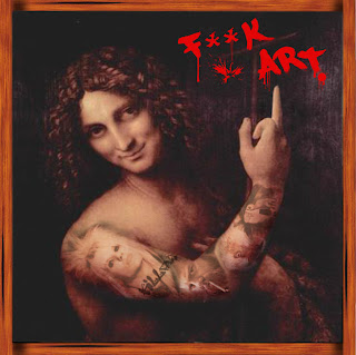
I had not used the full "F**k Art" image on any outdoor signage due to fact of how controversial it is. I came to the decision to use the image as the back page of my prospectus. I think it works well as a square image, maybe even better than the original. I tried to incorporate the grunge effect that i used on previous images but when the opacity was turned down on the main image, it lost most of the detail especially on the arm where the tattoos are, so the image was left as it was.


I was in danger of over using the American Gothic image that had fast become the main image associated with the college. I needed a new image and a new piece of art to deface and alter to convey the punk designer direction that i had chosen. Arguably the most iconic piece of art ever produced had so far in the project been untouched, the Mona Lisa. Similar to the Da Vinci piece of St John, i wanted to convey the fact that this type of art is all well and good but its dying, and we are the new generation of creatives. With this in mind i replaced the famous head of Mona Lisa with a skull as though she has rotted away and died. I went with a tag line of "A Dying Art" and put it in the same typeface as the "F**k Art" piece. This linked in with the street art/graffiti theme that i touched upon in my research
After creating the Illustration of the Mona Lisa i felt that it did not quite fit in, looks wise, with the rest of the pieces created for the brief. The Mona Lisa illustration had a much more street art and grungy feel than the rest of my work and so i set about altering my previous images to make them appear similar. This was easy to do, i used the same effect i used on the Mona Lisa Image, a grungy backdrop behind the image and then altering the opacity of the main image to allow the background to show through. My front cover was given the treatment and benefited hugely, it now looked much more interesting and appeared a little older than the original due to the yellowish/sepia tone that was now present.


I used the Mona Skull image, although not as visibly, on the outdoor sign for the college. I felt that having the sign empty of any image would not be an improvement on what the sign looks like now. I wanted the type to stand out from the sign and be clearly visible to the members of the public who drive and walk past everyday, day and night. The main type "School of the arts" is lit up from inside to add impact and to make 100% sure that the sign is visible. The contact info was in a larger type than the previous sign due to the fact that the contact info would be a lot easier to read when driving past at speed.


During my research of existing magazines, prospectuses and brochures i made the decision to have the college prospectus square, similar to a few high brow magazines like Creative Review and Waterlog
(private subscription fishing magazine). To get a better idea of how the finished 3D brochure might look i took a picture of a copy of Creative Review and then placed my image (with some difficulty) on the front cover. the finished prospectus for Wigan School of the Arts would not be as thick as the creative review in the picture but it is nice to get an insight into what the prospectus would look like when its finished, printed and bound.

I had not used the full "F**k Art" image on any outdoor signage due to fact of how controversial it is. I came to the decision to use the image as the back page of my prospectus. I think it works well as a square image, maybe even better than the original. I tried to incorporate the grunge effect that i used on previous images but when the opacity was turned down on the main image, it lost most of the detail especially on the arm where the tattoos are, so the image was left as it was.
